Using npm to create JavaScript icon libraries

Introduction
In this article, we’ll learn how to create a JavaScript icon library using Node Package Manager (npm). To get started, make sure you have the following:
- Node v14 (nvm, or Node Version Manager, can be used to specify Node’s version per working directory)
- An npm account
- A Figma account
Initial setup
Create a directory for your package on the command line, where $package_name is your actual package name.
After determining the name of your package, you’ll need to know whether it’s going to be scoped (i.e., package vs. @username/package). Finding a name and registering it early in your process is very important as names can only be used once and other developers might beat you to the punch.
To find whether a name is available, you can use this handy npm name checker, or you can type https://www.npmjs.com/package/ into your browser and append the name of your choosing to the end of the URL like so:
https://www.npmjs.com/package/iconslib
If the name is available, you’ll be greeted with a 404 page. If you suspect that the package is registered for future use, you can ask npm to give you the name.
Run $ npm init. In the case that your desired package name is unavailable, you can instead scope the package using your username by running $ npm init --scope=$your_username. This will prompt you to fill some common npm properties and create a package.json, which we will continue to fill throughout the article. Make sure to set the version to 0.0.0.
Your package.json should look something like this:
Choosing an npm license
Choosing a proper license is crucial to every npm package you build because, without one, many individuals and organizations will abstain from using your package.
Visit Choose a License to pick one. Copy the text and replace [year] and [fullname] accordingly, then paste the content to a license file on the root of your package directory.
Don’t forget to update the license property in package.json if you made changes.
Setting up Git and GitHub
From automatically updating your outdated dependencies to running tests and tagging your releases, GitHub will play a huge role in maintaining your npm package.
To get started, run $ git init in your package directory to initialize a new Git repository.
Then, create a README.md file with a short description, which you can later expand on, and a .gitignore file that contains the following:
After that, visit https://github.new and create a repository.
Before adding a remote or pushing any changes to this new repository, you’ll first want to modify your package.json by adding repository, bugs, and homepage properties. You can also add the keywords property to make your package more discoverable.
If you intend to have a website for your icon library, you can set the value of homepage to your domain name. The homepage is accessible via $ npm home <package>.
You can then go ahead and push your existing repository to GitHub:
Publishing early to npm
As previously mentioned, publishing early to npm protects you from getting your package name taken by others. To publish to npm, create an account and authenticate yourself on the command line of the root of your package directory.
This will prompt you to enter your credentials. After that, you will be able to publish to the npm registry with the following command:
This will create a public npm package using the name property you defined in your package.json.
If you want to unpublish your package, run $ npm unpublish $package_name -f. Ideally, this is done within 72 hours of publishing, but npm has some additional guidelines on unpublishing after that timeframe if need be.
Once published, your package will live at https://www.npmjs.com/package/$package_name.
Creating the icons
The flexible nature of SVG specs allows icon designers to achieve the same visual outcomes in multiple ways using different features of the specification, such as using path vs. the basic shapes, or fill vs. stroke.
However, when creating an icon set or library, some assumptions have to be made to allow for better optimization because you’ll have to distribute SVG files that are optimized as much as possible.
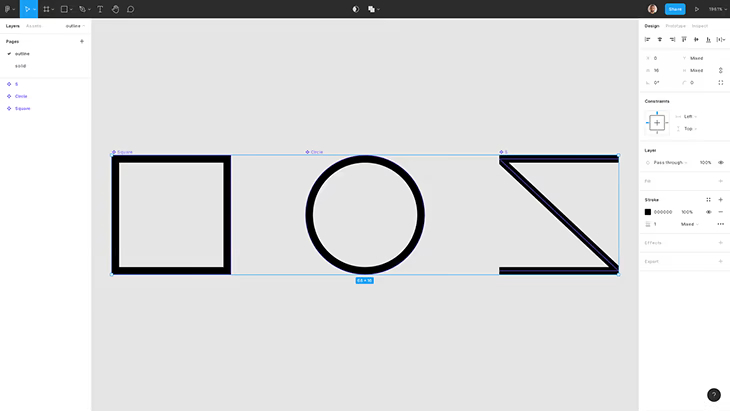
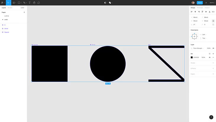
Outline vs. solid icons
One assumption you can easily make is to use strokes for outline icons and fills for solid ones. Solid icons tend to be used when recognizability is crucial, so fills would serve that purpose well. Strokes are well-suited for creating tiny details, so they work well with outline icons.
This is a useful rule of thumb for easy optimization because you’ll have a subset of your outline icons written using strokes and another using fills. You’ll avoid the nightmare of having individual icons that are written using both strokes and fills, which would be impossible to optimize in key ways.
Note that you will have to use different tactics if you’re creating a duotone icon set. Google’s System Icons guide is a good resource if you’re looking for further best practices on creating icons.
Using Figma as a design tool
The SVG spec is vast and only partially implemented by vendors, including editors and browsers. You will constantly “break” your SVGs by exporting and importing them to different environments.
If you work with Figma, you can use the pen to branch out from a predrawn vector and create miter joints. Unfortunately, that does not materialize the same way in browsers just yet:

Exportable icons in Figma
To be able to programmatically export icons from Figma later in your npm package build process, you’ll need to create Figma components from your icons and separate them into outline and solid pages.
Creating a build process
Programmatic export
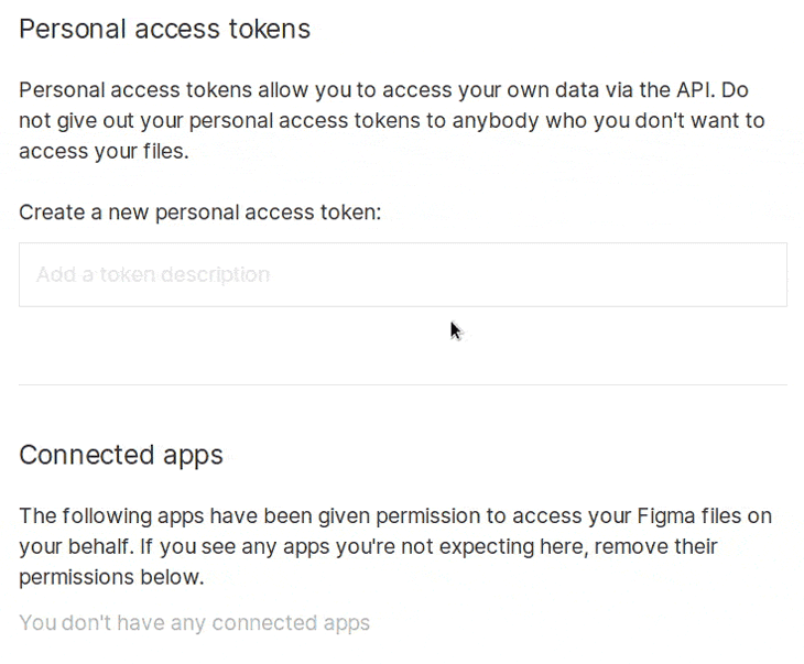
Once that’s done, use the figma-exportpackage suite to export your icons from Figma automatically. You’ll need a personal access token that can be obtained from your Figma account settings, as well as your Figma file’s ID.
The highlighted section of this URL is your file ID:

To quickly test our Figma icons, we can run the following npx command:
Replace FIGMA_TOKEN‘s value and V7WbFH5FKFahwtiqWdxzoO with your token and file ID, respectively.
The command should create an output directory that contains the following:
If the export is successful, we can proceed with creating the npm package.
Installing dependencies in your npm package
Back in our package directory, install dotenv, @figma-export/cli, and @figma-export/output-components-as-svg as dev dependencies:
In a .env file, include the FIGMA_TOKEN environment variable as such:
dotenv will be used to load our variable in the build process.
Configuring figma-export
Create a figma.config.js file in the root directory, and then proceed with the following steps:
- Require dotenv‘s config function, which reads .env and stuffs process.env with your variables
- Define a fileId constant holding your Figma file ID env variable
- Define an outputters constant for figma-export’s output directory
- Export an object with the type FigmaExportRc, which helps with autocomplete and pulls from both solid and outline Figma pages
To test if this is working, run $ npx figma-export use-config figma.config.js, which should create separate solid and outline directories holding our icons.
Optimizing icons
For optimization, we’ll be using the ubiquitous svgo. SVGO optimizes our SVGs based on the set of plugins we configure it to use. You can test out a subset of these rules directly in the browser using this SVGO frontend tool.
As for the optimizations, we’ll apply the default configuration and deviate where we see fit.
removeDimensions
By removing width and height in favor of viewBox, you avoid relying on the default size. This helps in identifying badly exported SVGs, where the design tool adds in a pixel or two to the SVG’s dimensions — changing an icon from 100px to 101px, for instance. Relying on the default size will make the SVG look crisp, but manually resetting the intended size to 100px will cause the SVG to look slightly blurry and prompt you to re-export it properly.
removeAttrs and addAttributesToSVGElement
The reason we split solid and outline variant optimizations is so that we only have a single occurrence of specific attributes. removeAttrs will allow us to remove an attribute of our choice entirely from the SVG and addAttributesToSVGElement will allow us to add it back to the svg element itself.
Setting currentColor values
currentColor is widely regarded as the first CSS variable. Setting a color value in CSS to currentColor (border: 2px dashed currentColor, for example) would automatically and reactively pick that element’s color property value.
In our SVGs, we can prepopulate the fill and stroke attributes with currentColor to make it easier for users to override the color of the icon.
Note that when the SVG is used in <img src="our.svg" /> for browser caching purposes, currentColor will simply render the SVG black. To change the color in this case, you can make use of SVG’s feColorMatrix filter.
Also, note that fill="none" in outline SVGs needs to remain as-is.
Optimizing SVGs
To make use of svgo, we can directly install and run it against our exported SVGs. But since we’re already using figma-export, which has svgo integration as a transformer, we’ll use that instead.
Alongside the default configuration, we’ll add these optimizations, with sortAttrs being a stylistic choice:
Finally, we’ll add a figma npm script for our icon creation command:
Running $ npm run export will output our outline and solid directories.
Packing your icons
To publish your icons, we must first determine what gets published. For that, npm’s package.json uses the files property. When you don’t give it a value, npm will publish everything that isn’t included in .gitignore. For our purposes, outline and solid are all that need to be published, so we’ll add a files array to package.json as such:
Note that README.md, package.json, and LICENSE are all published regardless of settings. With that change, we can now test and publish our package.
Testing and publishing our npm package
To simulate publishing our npm package, we can use the npm pack command. Running npm pack will create a TAR file named after your package’s name and version. We can unpack the TAR file to test our package.
This will output a package directory that holds our published files.
It’s very important to note that if you delete or modify the outline or solid directories after running npm run export, then those modifications will be published as npm pack would indicate. For that reason, we should set up an npm script for cleaning, exporting, and publishing the package to eliminate any chance of interference.
Clean and build scripts
To clean our workspace, we need to remove the outline, solid, and package directories as well as any TAR file, although package and tar files are excluded from publication.
We can resort to $ rm -rf for removing these directories and files, but rm is not cross-platform. An alternative would be to install rimraf and use that instead.
To build our package, we will run the scripts clean and export consecutively using the npm-run-all package, which exposes a run-s script we can use.
Running npm run build will now run our clean and export scripts.
Testing
Automating our icon exportation from Figma means we can now write a simple test script to make sure our icons have been properly exported. To do that we can install cheerio, a markup parser, to validate our viewBox attribute.
To test our icons, we will create a test.js that contains the following:
This reads all SVGs from outline and solid directories and loops over them, comparing their viewBox attributes against 0 0 16 16. If the comparison fails, we display a helpful message and exit the node process with a 1 exit code, indicating that our test script has failed.
In our package.json, we should update our scripts, adding a test script:
npm t is a shorthand for npm run test that we can use to run our test script manually.
Publishing our icons
Publishing a new version to npm entails running tests, bumping the package version, and adding a Git tag.
Semantic Versioning
For bumping the version, npm uses Semantic Versioning, or semver, through its npm version command.
semver is one of the most popular formats for API versions. For our purposes, a simplistic MAJOR.MINOR.PATCH format will suffice.
According to semver, MAJOR should increase when your changes break existing uses of your API. MINOR is reserved for added functionality while maintaining backward compatibility. PATCH should increase when our changes aim to fix a bug.
After committing your changes to git, running npm version followed by either major, minor, or patch would increase the version accordingly.
Git tags
Git tags are used to link a specific release with a point in Git history, which comes in handy when working with users using non-latest versions of your package.
To create a tag, you can run git tag v0.0.0 -m initial release with the corresponding version and an annotation.
A better npm publish
With the addition of testing, bumping the version, and tagging our releases, it is very possible to accidentally skip a step while releasing a new version. To help safely publish our package, we can rely on np.
In our package.json, we will add a release script that runs build and np.
To publish our release, we should first commit our changes — without pushing, as np will push our changes for us — and then we should run:
This will build our package and prompt us to bump our version and run multiple checks against our Git repository and npm dependencies. np will then open a new release page in GitHub to allow us to annotate our latest tag and add attachments.
Using SVGs as React components
There are multiple ways that users can convert SVGs for use as React components on the fly. We can, however, do the work upfront to make our package more versatile.
We will be relying on svgr to transform our SVGs into React components. And like svgo, figma-export also has a plugin for svgr that we’ll use.
In figma.config.js, we can add an additional value to our outputters array as such:
Running npm run export will now create a src directory that has outline and solid sub-directories holding our React components.
These React components are written in JSX, which means that the user will need a build step to consume them. Therefore, we will use a bundler to transpile the components into JavaScript. We will also add TypeScript support.
We’ll first create an index.js entry point for Rollup at the root of our project that will export our React components.
Then, modify our outputters to generate tsx files.
Next, we’ll create tsconfig.json and rollup.config.js files as well as a bundle npm script to bundle our files into a react/index.js file:
Running npm run build will generate a react directory with an index.js that holds our bundled components, which we will specify as our main entry to the package in package.json.
Users will be able to use these components by importing them as such:
To publish React components’ support, we must first add the react directory to npm’s files, clean script, and .gitignore alongside src before we run npm run release. We should also add a peerDependencies field to indicate that react is needed to use our package.
Using sprites and CDNs
Sprites are single files that hold all of our icons, and serve as yet another way to use SVGs. To display an icon, we rely on the use SVG element:
For some projects, sprites are the most appropriate way to consume SVGs. Thus, we will export sprites for our SVGs and make them readily available through package CDNs.
To start, we can install @figma-export/output-components-as-svgstore as a dev dependency:
And then we can add another item in our outputters array and point to a sprite directory. We also use our icon names as ids and lowercase them.
Running npm run export would generate sprites in a sprite directory.
By adding our sprite directory to .gitignore, clean script, and files array, we can publish our sprites to npm.
We can then point to either our outline or solid sprites whenever someone visits our package through a CDN like unpkg or jsDelivr by adding unpkg, cdn, and jsdelivr fields in our package.json and point them to our sprites:
If someone were to visit https://unkg.com/$package_name, the URL would resolve to our outline.svg sprites.
Conclusion
This blog post covers publishing to npm, creating optimized icons, and directly exporting them from Figma. We also tackled testing and added React and sprite support.


